Hired
Improving the recruiter's sourcing workflow to boost discoverability of relevant candidates on Hired.
Hired provides two discovery paths for employers to source for candidates. With each experience having a different set of capabilities, it was difficult for employers to find relevant candidates that met their requirements.
Role
Product Designer
Duration
2019-2020
Research Methodologies
Survey, diary study, user journey mapping, usability testing
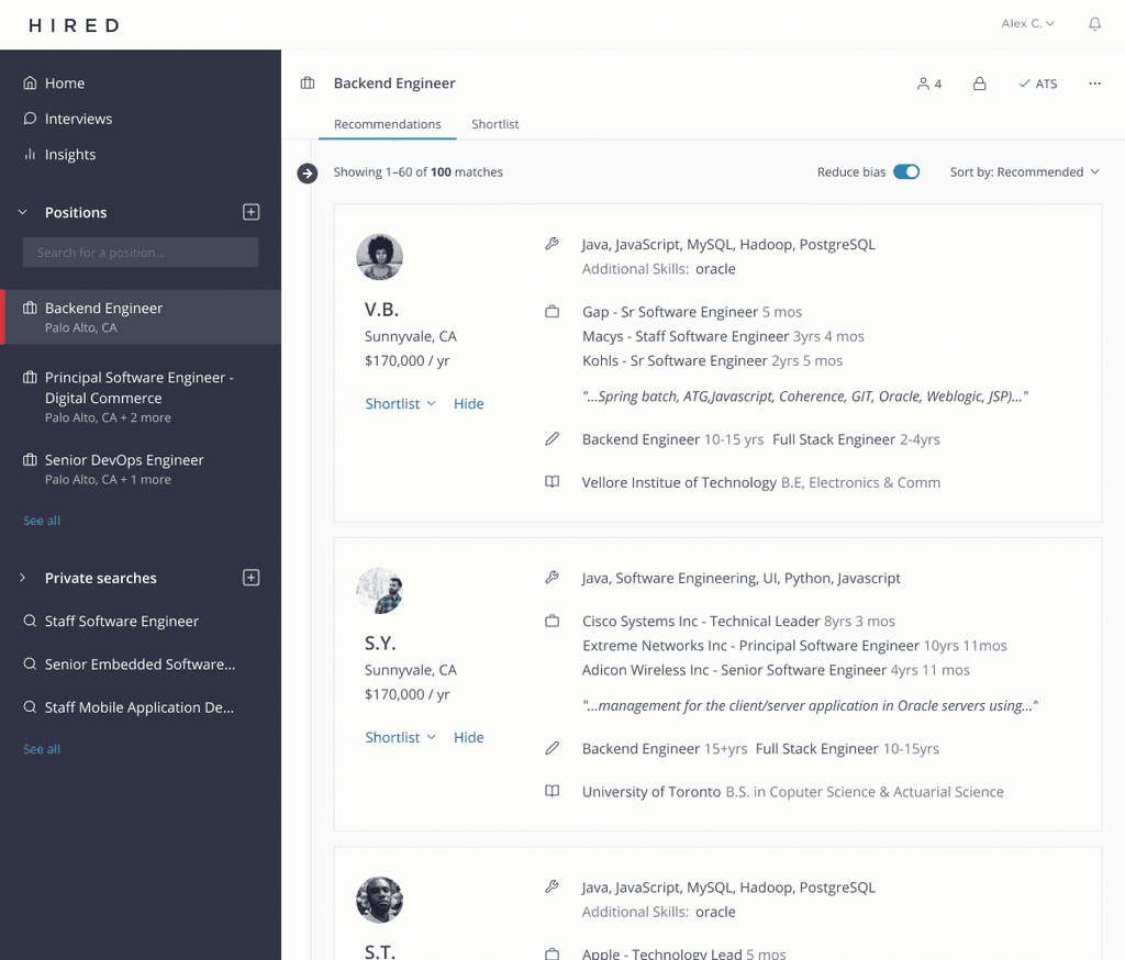
An employer can either create a position or search the database to find candidates.
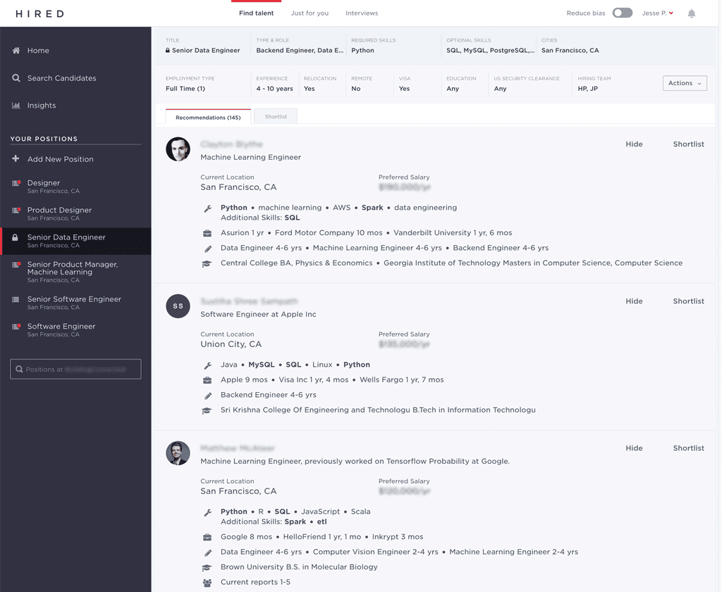
Position
A user answers a series of questions about the role they are trying to fill and is presented with a recommended list of relevant candidates each day.
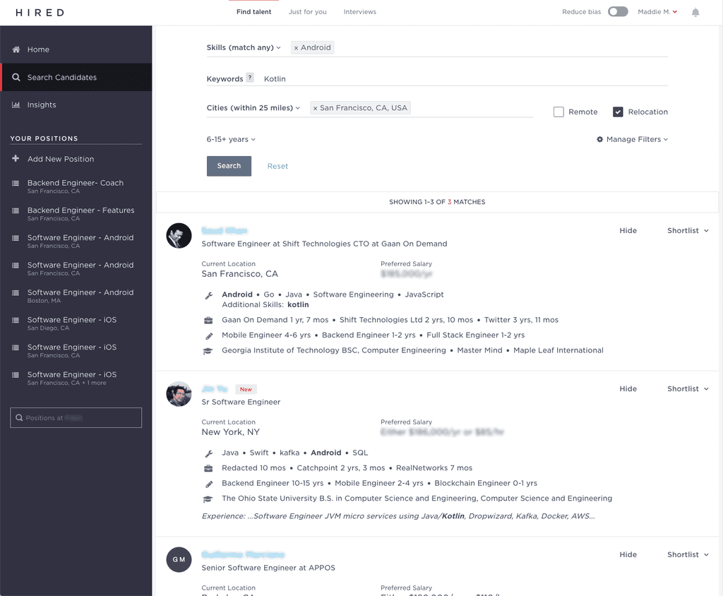
Search
A user is able to search the entire Hired database to find relevant candidates that they can then reach out to or shortlist for certain positions.
The process of starting a new project at Hired usually begins when a PM shares their opportunity assessment at a kickoff. My PM shared key problems our customers were facing and I decided to conduct additional research to validate our assumptions.
Since I was new to Hired at this time, I took the opportunity to learn more about an employer's sourcing workflow and at which points felt most friction when using Hired.
Note: The survey and diary study was conducted by our lovely in-house researcher. I served as an assistant.
Survey
I worked with our in house researcher to conduct a survey followed by a diary study of select employers. The survey gave us a macro level understanding of the problem and provided us with a baseline of persona types and company segments we needed to pay attention to. It also acted as a screener for us to recruit relevant employers for the diary study.
Diary study
The diary study provided us with micro level insights on specific employer behaviors and pain points as they sourced on Hired. Around five employers were given a week to to log their reaction and feelings as they evaluated candidates on Hired each day.
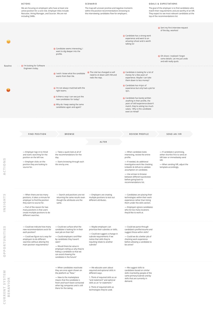
User journey map
Using the data we gathered from the survey and the diary study, I was able to create a journey map to visualize areas of frustration in an employer's sourcing workflow and opportunities for us to improve the workflow.
My PM, EM, and I agreed on a timeline of features to tackle based on technical feasibility and by order of dependency and shared our roadmap to our broader stakeholders. This is a visualization of this roadmap I had created to ensure alignment across teams.
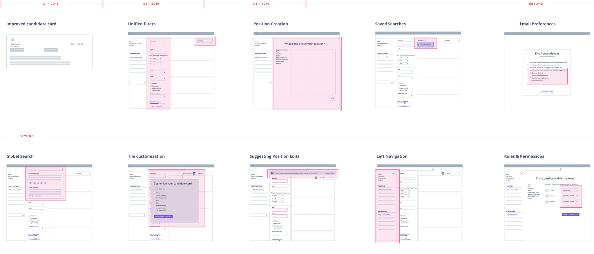
Q1
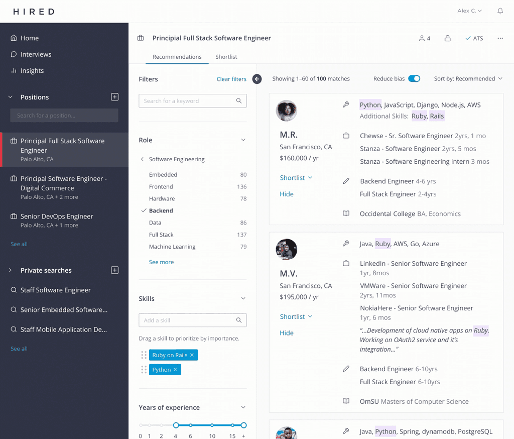
Improved candidate card
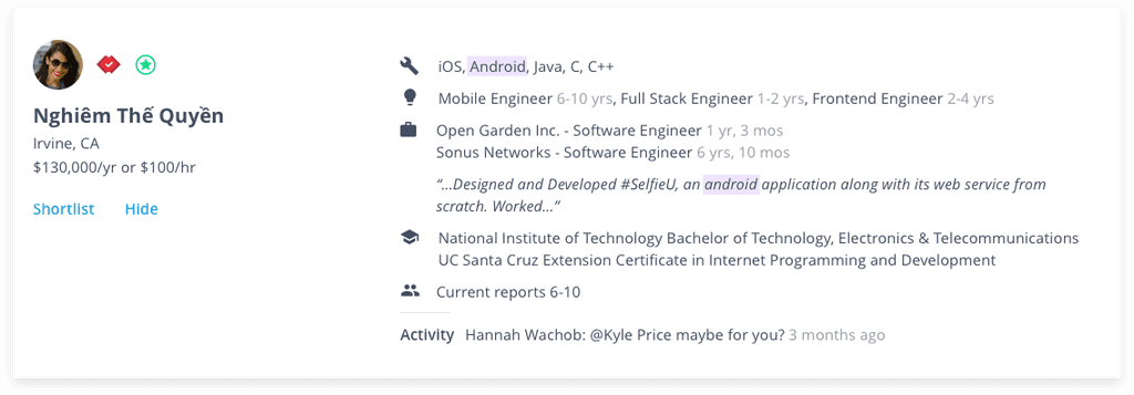
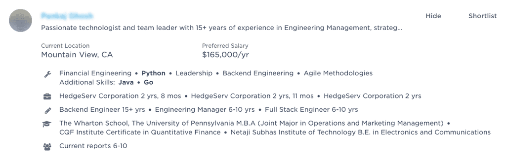
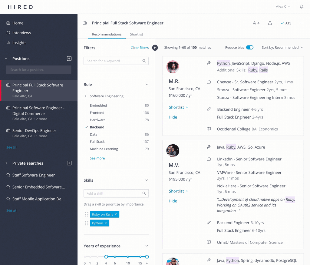
We initially decided to address a piece of the experience that we received the most amount of feedback on: the candidate card.
Employers had complained that the layout of the card made it difficult to skim and digest a candidate's work experience. They often resorted to viewing the candidate's detailed profile but the information was too cluttered even there for a quick initial evaluation of a candidate.
From the employer feedback, I was able to create quick iterations of the existing card with a minor enhancement to highlight skills and keywords the user searches by. I increased the click-target to the size of the entire card and made the Shortlist and Hide actions more prominent by placing them to the left below the name.
Overall, negative employer feedback on the candidate card drastically decreased since the improvement.
Q2
Unifying filters across search and positions
Next, we wanted to unify the filters available to employers in both the position view and the search view. Prior to this change, employers would often create a position to view candidates and then would have to go to the search view to further filter by keywords.
By unifying the filters in these two areas, we wanted to erase the differences from one page to the other. The hope was to eventually eliminate the search page and transition users to private searches.
Usability testing
During this project, I took the opportunity to reevaluate the our existing filtering UI. Though there wasn't scope set to redesign each filter, I was able to explore options for a vertical and horizontal view of filters. After testing each solution with multiple users, a vertical UI for filters turned out to be the winner.
Q3
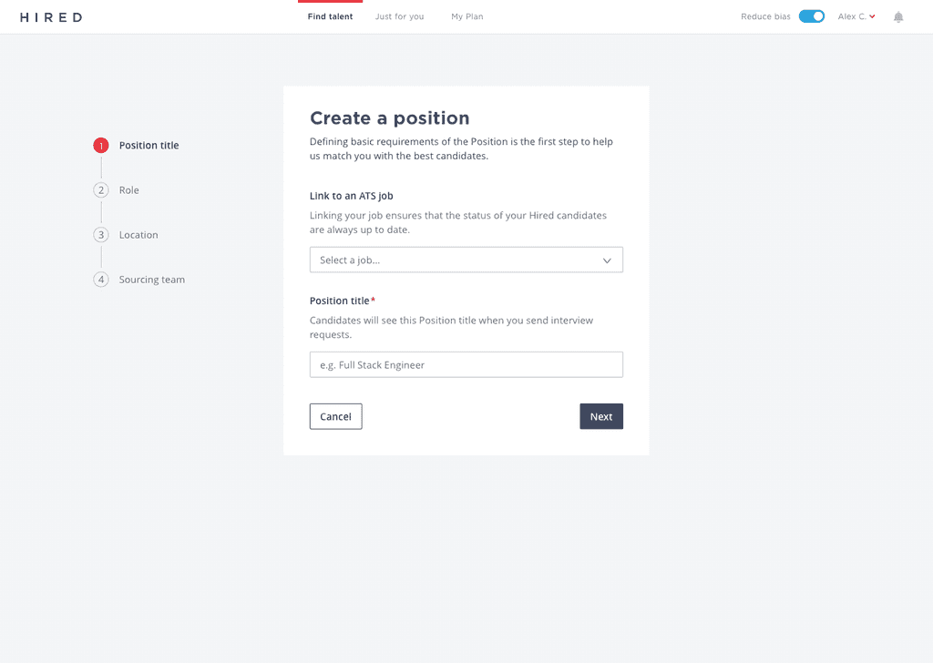
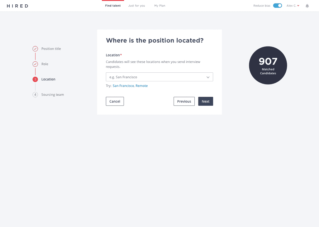
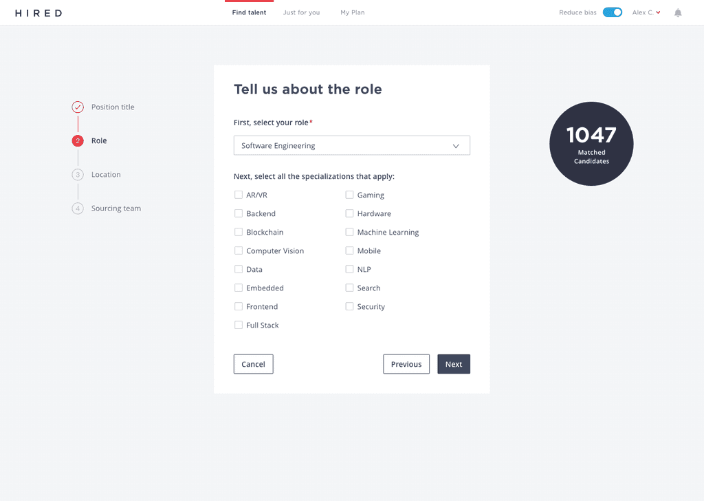
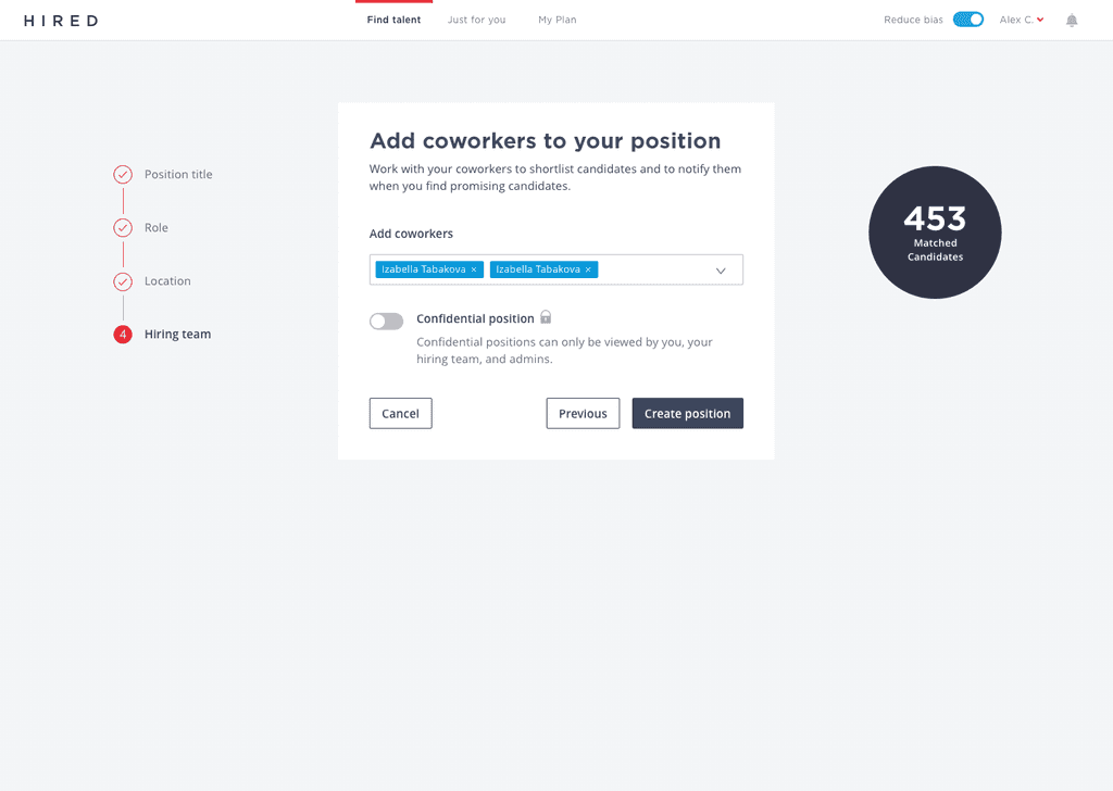
Shortening the time and steps to create a position
While the filters allowed employers to narrow results, we noticed that when they were applied, users often came to a dead end with 0 results.
We suspected that the problem originated when the employer decided to create a position. The existing 10-step modal to create a position made it difficult for the employer to understand the quality and volume of candidates on Hired.
I improved the flow for new and existing users and decreased the number of steps it took to get to the value prop, which in this case were the candidates on the platform. I wanted to erase the perception that Hired never has enough candidates.
Usability testing
Our biggest fear was that our users would be confused that wouldn't be able to filter candidates by their skills in position creation. We decided to test out the design to see if the shortened position creation flow had a negative impact on our users. It didn't.
Q4
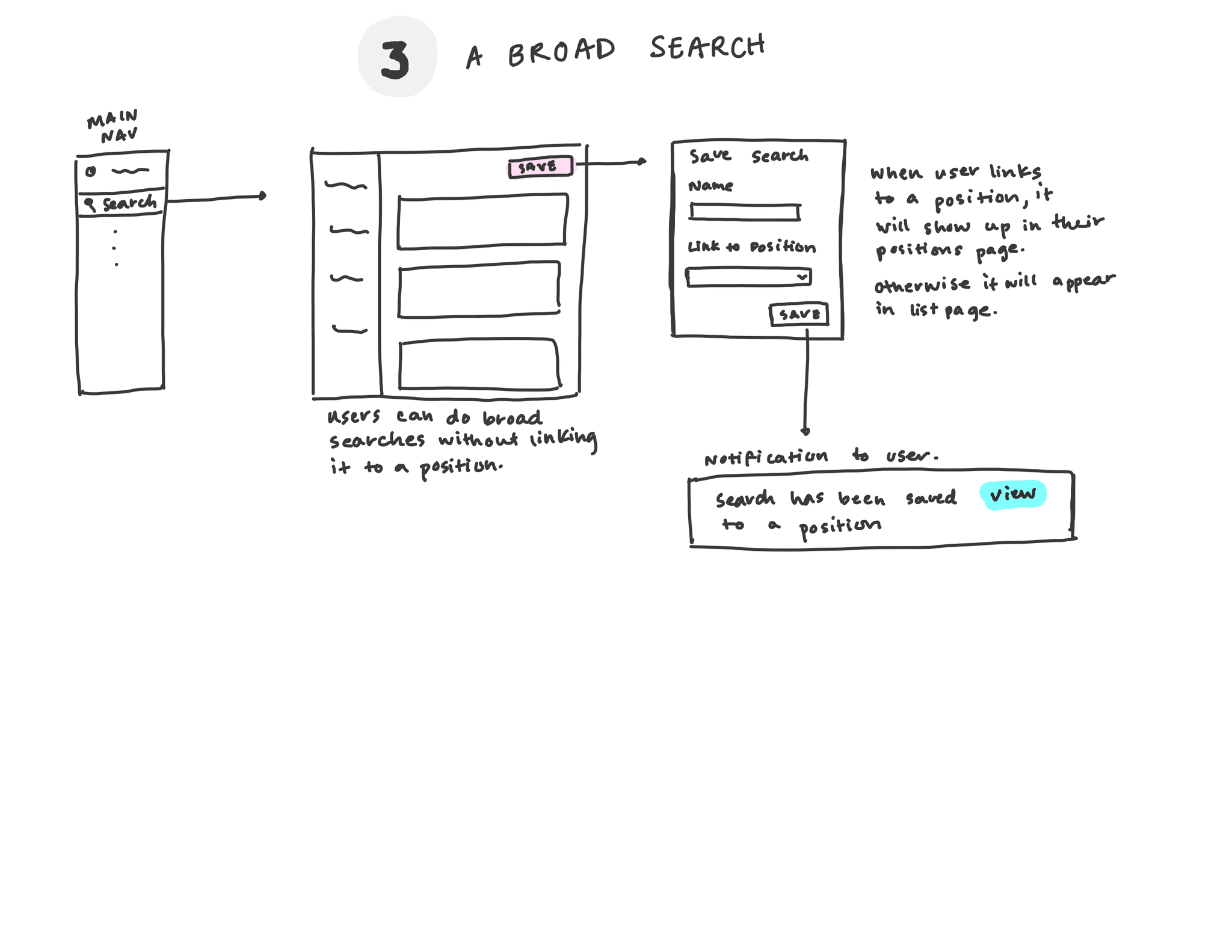
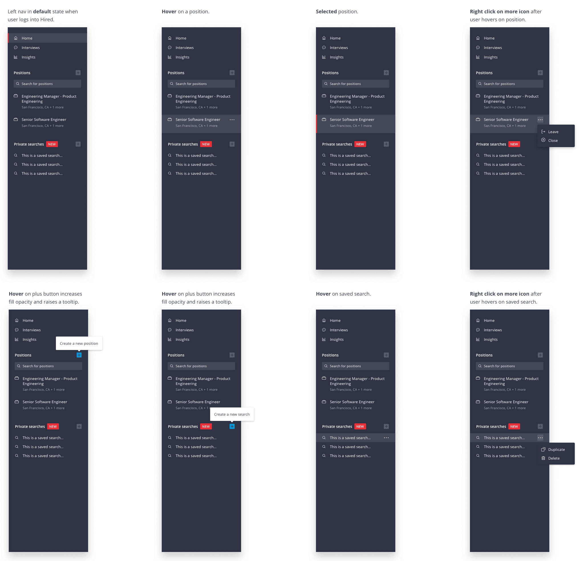
Introducing private searches
Lastly, once we had unified the filters for positions and in search, there was essentially no difference between the two discovery paths. We decided to eliminate the search page and instead introduce the ability to save private searches on Hired.
In a company, when there is an open role identified, recruiters work with hiring managers to create a position together on Hired. This essentially acts as the source of truth in terms of the requirements they had agreed upon. Recruiters are cautious of changing any of those requirements set by the Hiring Manager and will often create their own dummy positions to loosen or tighten requirements.
With private searches, users never have to change an existing position and are able to save multiple variations of searches if needed. In addition, employers who are not yet ready to hire but want to create a sourcing pipeline are able to do so with private searches.
This was a difficult project where there were multiple cooks in the kitchen, each with their own belief of the ideal relationship between a search and a position. As a result, we explored multiple concepts on how these two objects would relate on Hired.
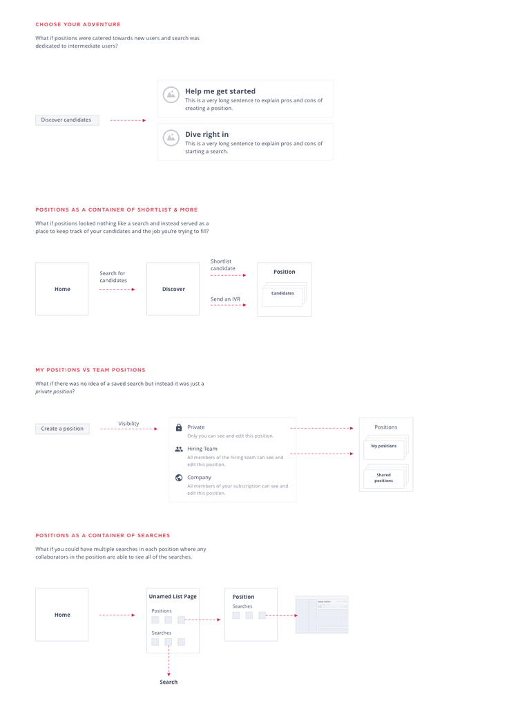
One of the concepts I explored further was the idea of having multiple searches within a position. In an initial round of testing, multiple users expressed interest behind this idea.
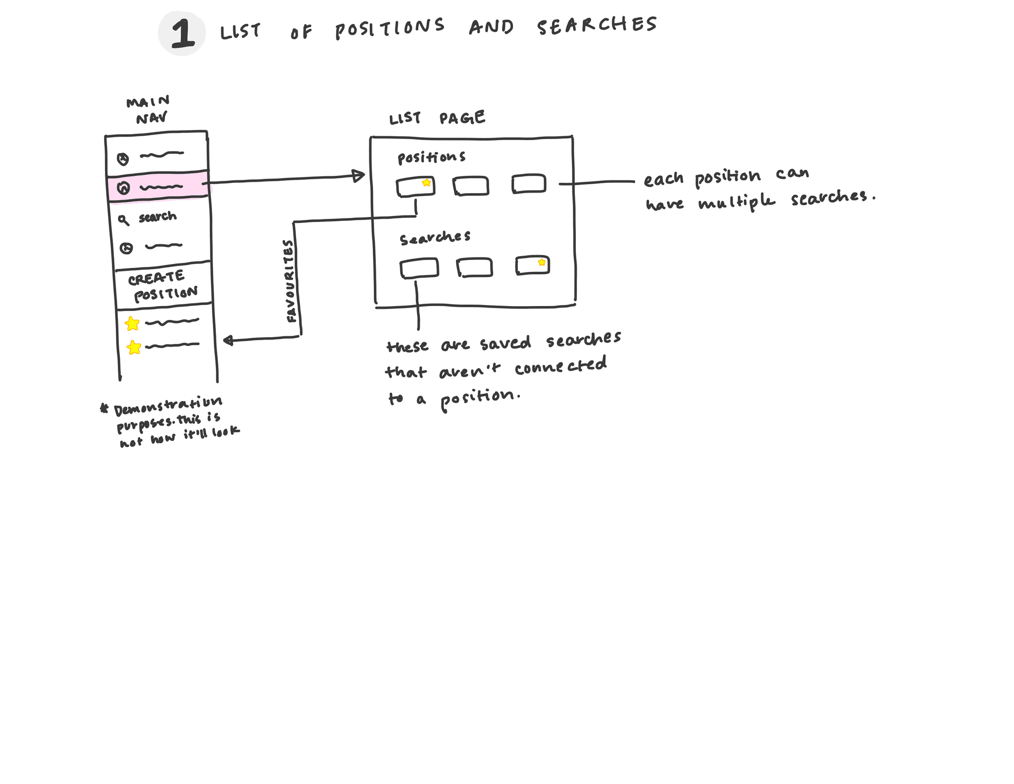
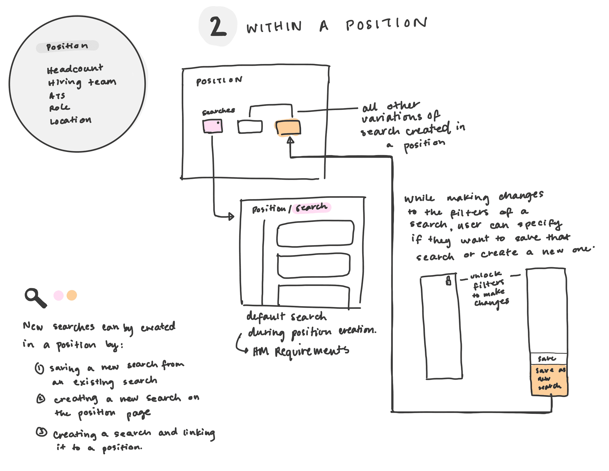
Upon further testing of this concept, we found that users were perplexed and couldn't understand the idea of searches within a position. One user went so far as to say that this was too complex for him and he preferred a simpler feature.
Finally, we decided to keep the position as is and allow users to create as many private searches as they wanted to outside of the position. In addition, they could easily duplicate these private searches if needed.
Updating the navigation
The navigation incurred subtle changes to include the addition of saved searches. I also added action menus to allow quick duplication of objects like positions and searches.
Outcome
The team recieved positive feedback on the changes to the candidate card, the unified filters, and the position creation flow. I left Hired while we were in the process of rolling out the private searches to employers. Historically on Hired, positions where at least three candidates have accepted an interview request that an employer sends are more likely to succeed. With these projects, we saw an increase in positions with 3+ candidates accepting. We also saw an increase in usage of positions and a decrease in the usage of search. Lastly, we noticed an increase in positions that returned at least 15 candidates.
Nice! Thanks for taking a look. Interested in working together? Send me an email.