Asana
Transitioning to new pricing and packaging
Overview
The Price is Right was a cross-functional effort to update our pricing and packaging for our customers. I led the design for all billing surfaces. I audited our billing surfaces, identified areas of priority, and explored multiple solutions to allow for a smooth transition to a new plan.
Duration
~4 months
Team
Payment Platform
Team Partners
PM, EM, Tech Lead
2 Engineers
Content Designer
Team Partners
R&D, Brand, Product Marketing, Legal
The opportunity for Asana
How might Asana evolve the pricing and packaging structure to accelerate expansion into Enterprise?
Why it felt like the right move
Asana brought in external consultants to evaluate the current pricing and packaging structure. They found three core issues:
Poor sales offerings - Our pricing & packaging was rigid and didn't allow for our Sales team to offer flexible plans to our potential customers.
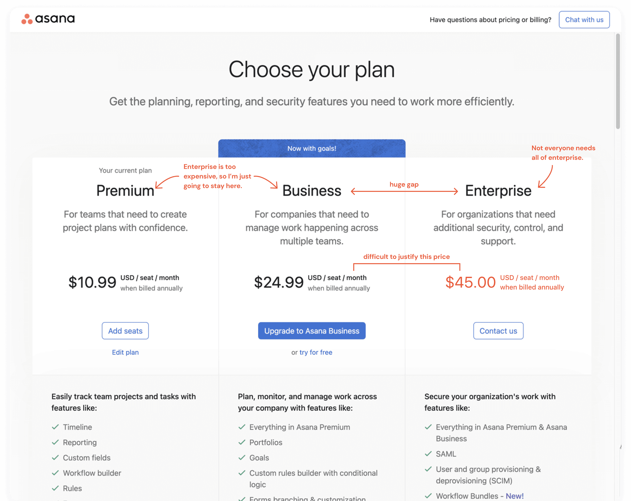
A large upgrade jump - There was a large price jump between our plans. With Business at $24.99 per user per month and Enterprise at $45.00, it was hard for customers to justify upgrading to Enterprise.
Inefficient value capture - Customers were getting stuck in tiers because our packaging was not tied to the value they received.
We wanted to ship an MVP in four months
Asana set an aggressive timeline of shipping an MVP in four months to address the issues above. We had a few obvious next steps to tackle and hoped that with the MVP, we could:
establish a foundational system to drive and optimize our revenue for the next year
encourage Business customers to transition to Enterprise tiers to build revenue for the remainder of the year
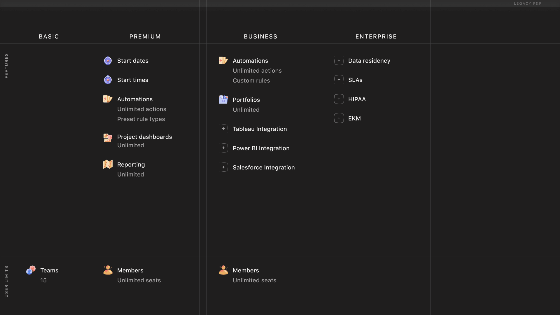
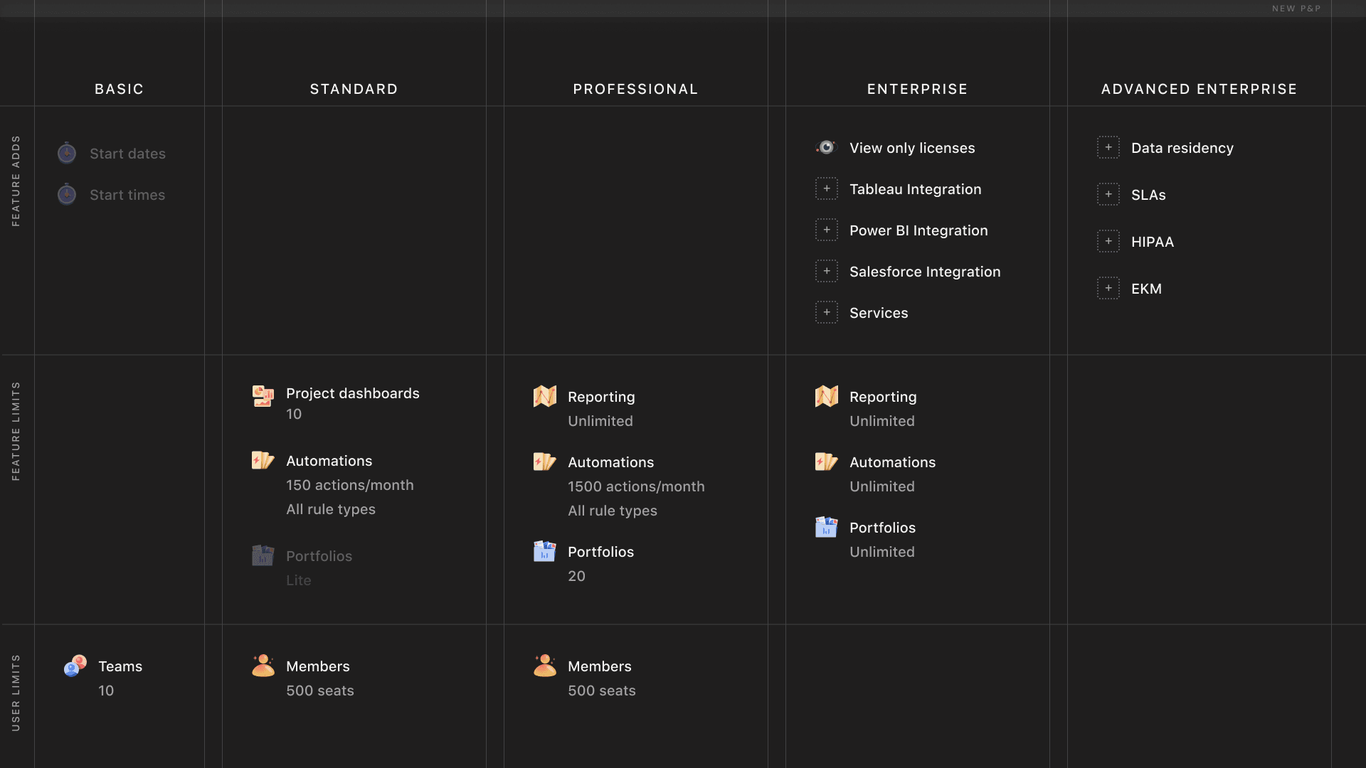
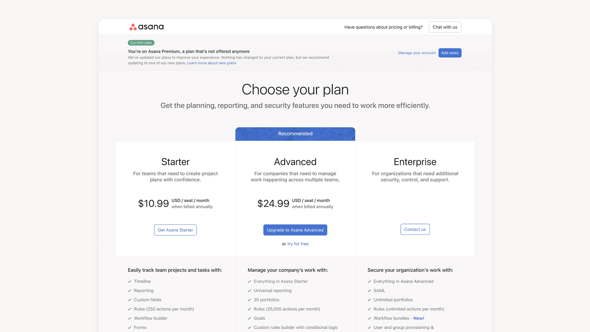
The proposed new tiers
There were a few key changes being made:
Asana wanted to introduce usage limits to limit the value per package and encourage users to upgrade. With our new plans, the most valuable paid features like Rules and Portfolios would have limits per plan.
Valuable integrations would be moved from Business to Enterprise.
There would be two Enterprise plans to alleviate the stark price jump.
How was I involved?
The overhaul of the Pricing & Packaging was a cross functional initiative in the company. There were four product designers dedicated to this work. Below is the distribution of the designers and their responsibilities.
Usage limits: Annu J. (Adoption & Enterprise)
Usage limits for Portfolios: Matt F. (Clarity Pillar)
Usage limits for Automation: Shin H. (Workflow Pillar)
Billing: Sindhu A. (Adoption & Enterprise) 👈 🙋♀️
I was responsible for updating our current billing surfaces to reflect the changes in our pricing and packaging.
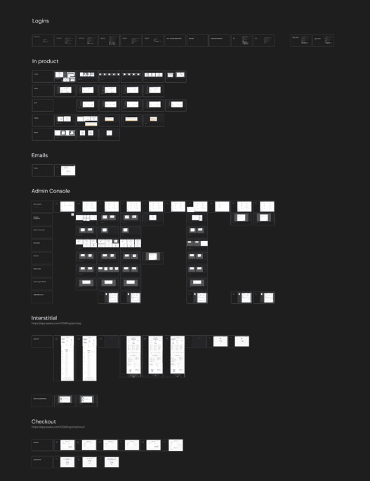
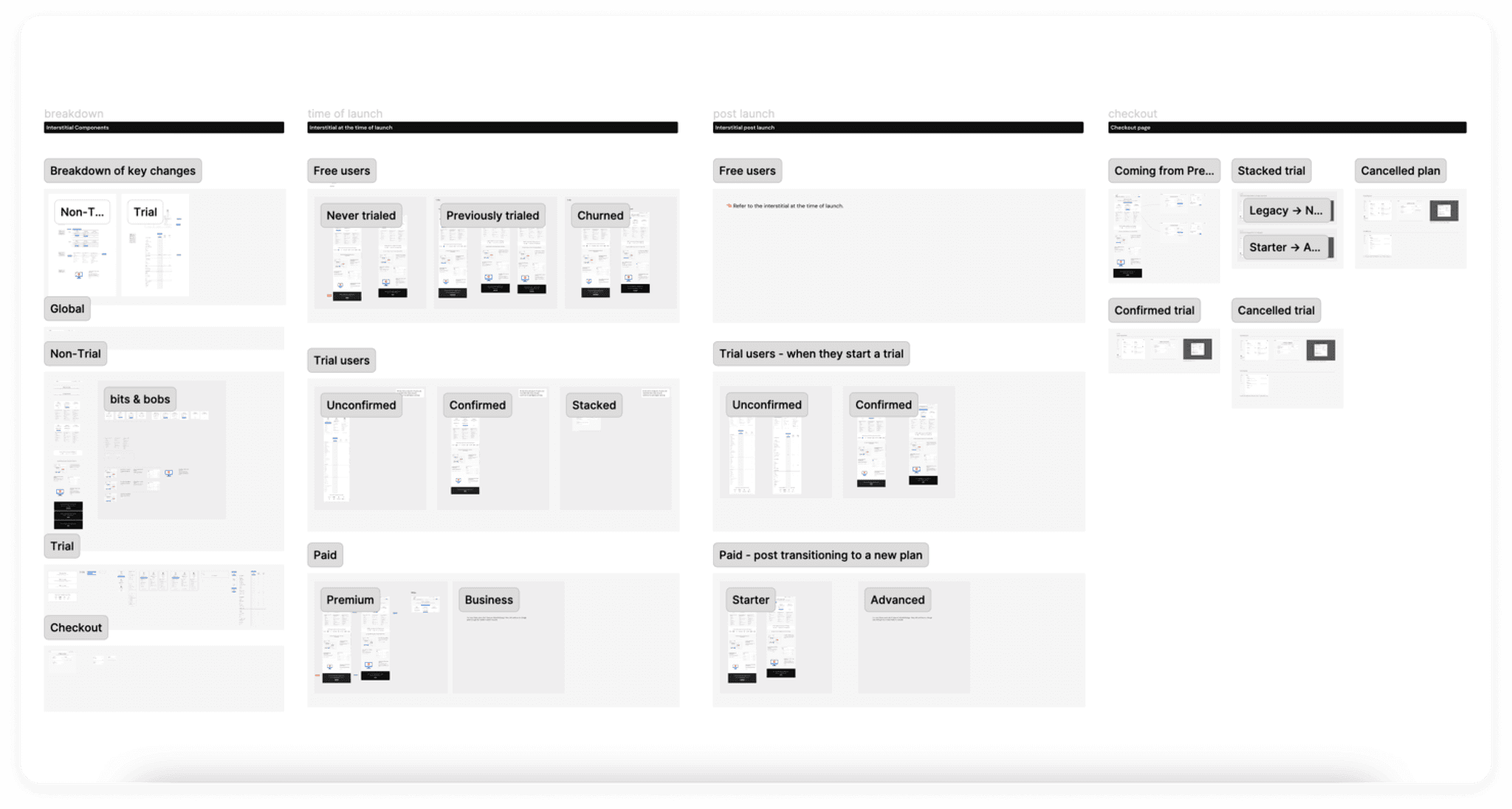
Audit
I worked with my PM and Eng leads to define user types and the billing surfaces we wanted to record. Once we created a list, I captured all the experiences in a deliverable that looked something like this:
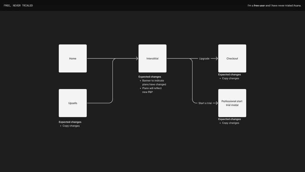
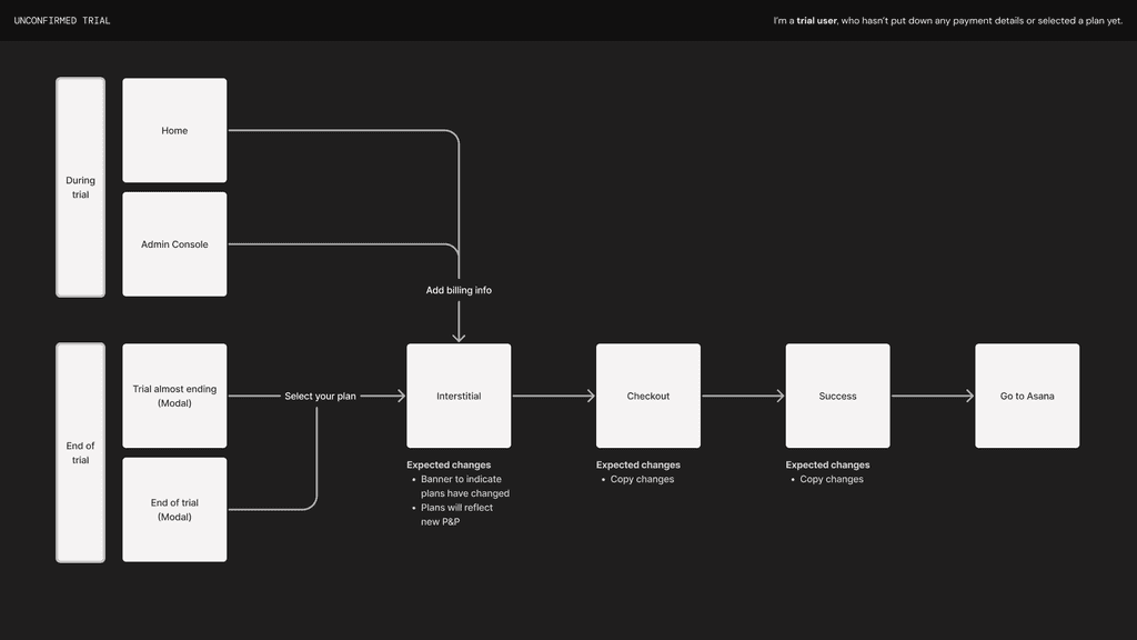
Changes by user flows
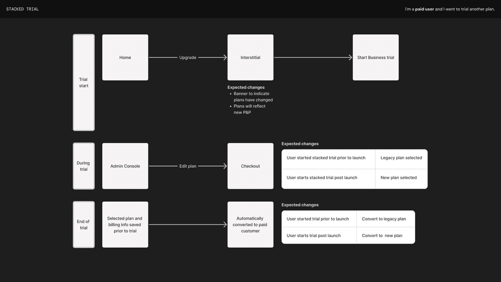
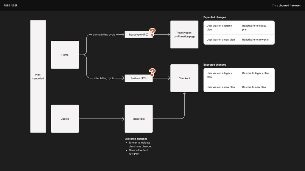
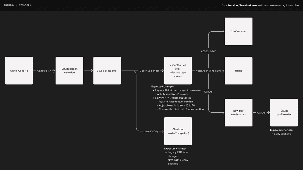
My Eng lead, PM, and I identified billing flows per user type and clearly communicated expected changes for that flow at the time of launch.
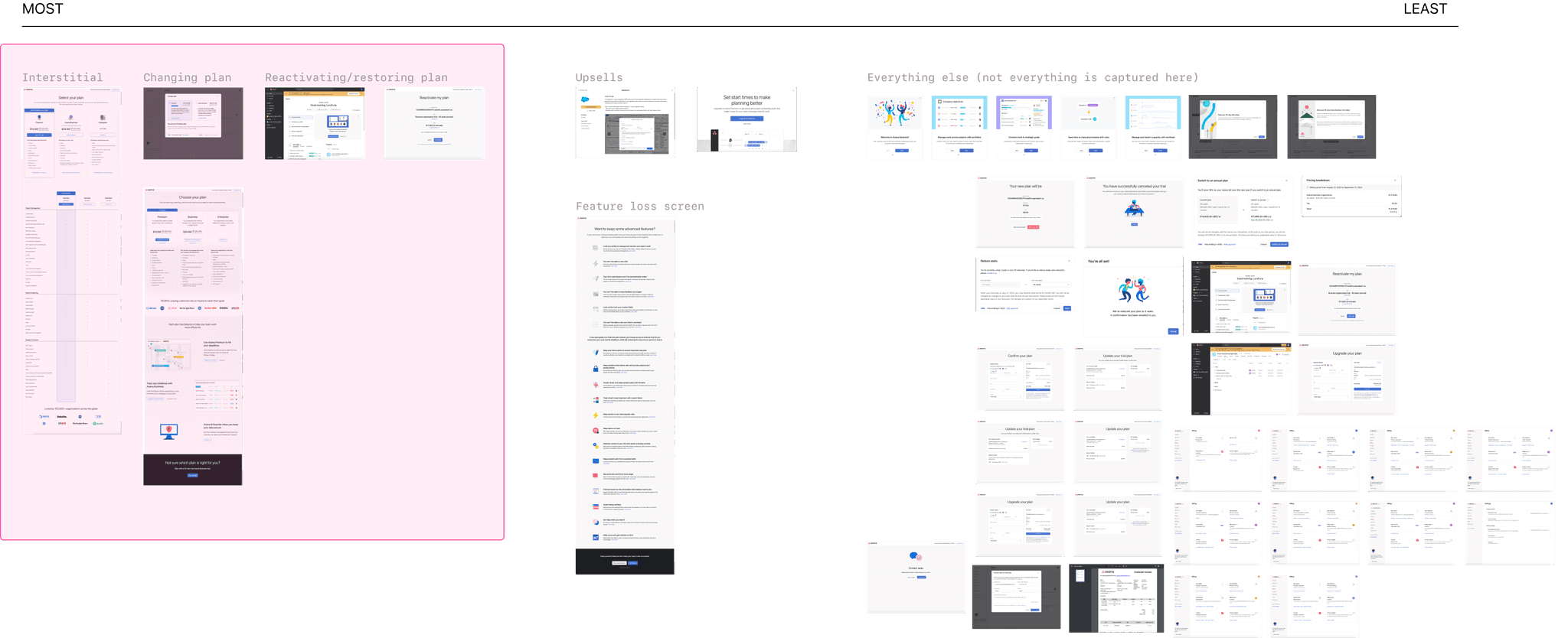
Surfaces to prioritize
To better communicate the depth of our audit with our stakeholders, I created a visual representation of key surface areas to prioritize depending on most to least changes. This helped ease everyone's mind on the amount of surfaces we'd need to work on for MVP.
Emerging principles
As we were auditing and deciding expected changes, I started noting down key principles that emerged. This served as a guideline for my design decisions throughout my work.
Keep changes minimal Luckily, the majority of changes we anticipate are just text swaps. Where possible, we will reuse existing design patterns.
Use interstitial to educate The interstitial page will act as the source of truth in product. Where we can, we should leverage this page as education to reduce design complexity across billing surfaces in product.
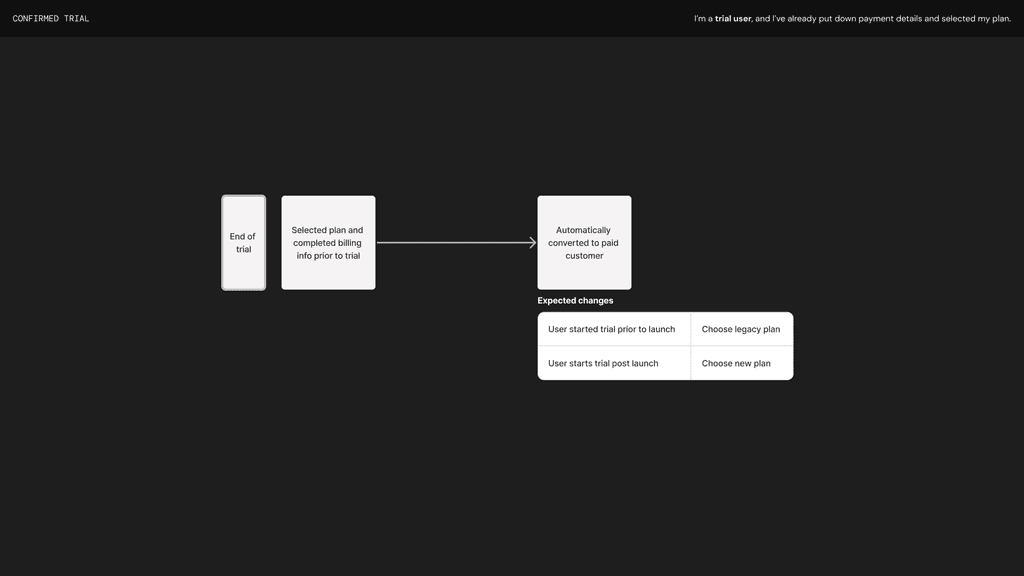
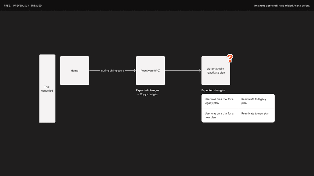
Continue the conversation We’d like to avoid changing the rules mid-conversation. So if a user selected a legacy plan on a trial before the launch, they’ll be able to move forward with that legacy plan even after the launch.
Encourage a transition To speed up the migration, we identified opportune moments when users are modifying their plan in the Admin Console where we can encourage them to transition to the new plans.
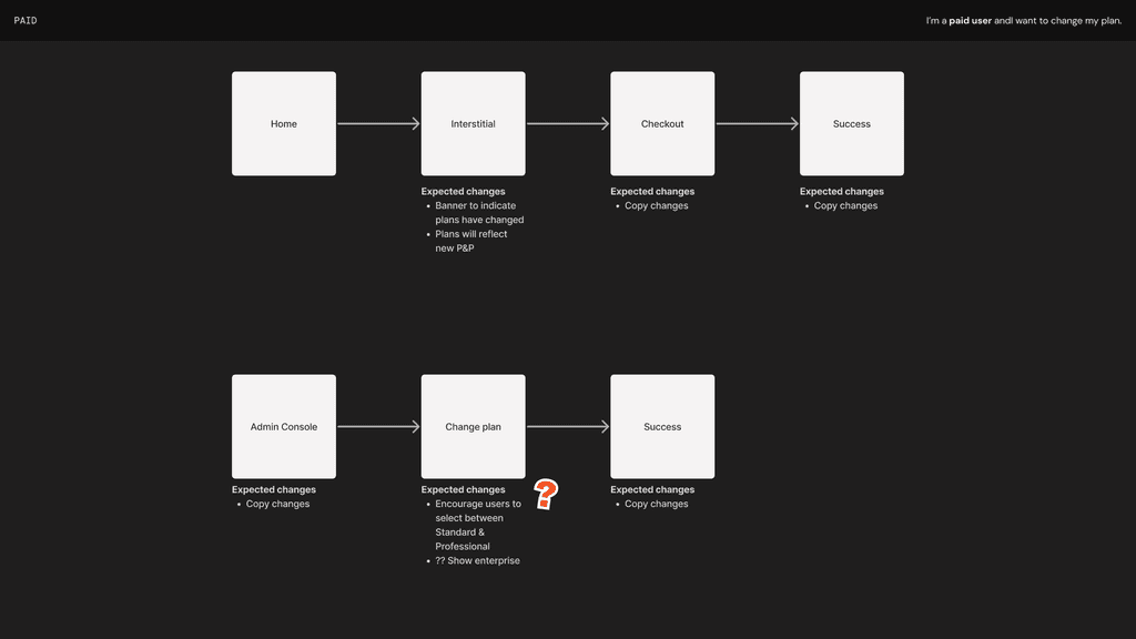
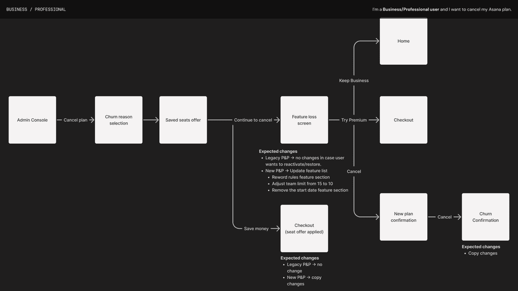
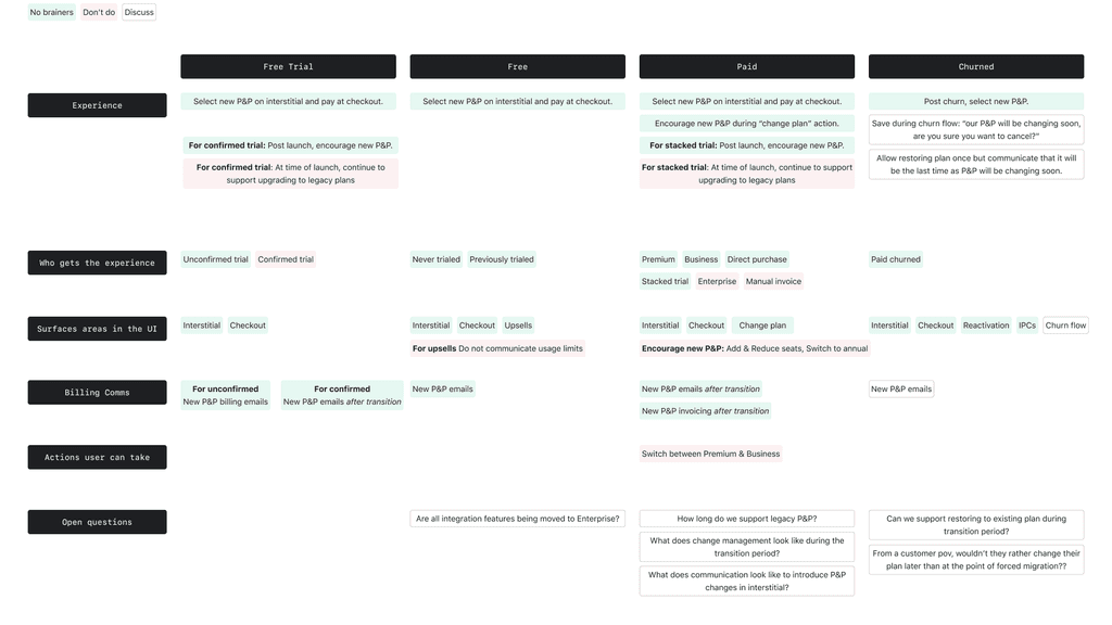
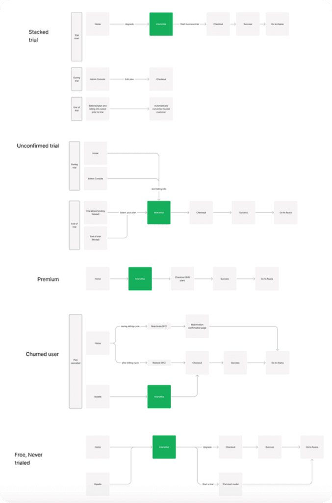
Affected billing surfaces by user type
Because there were so many surfaces to cover, we wanted to quickly be able to share our decisions on the surfaces that should and shouldn't be touched. In this visual, I noted the expected experience by user type and open questions across the adoption journey.
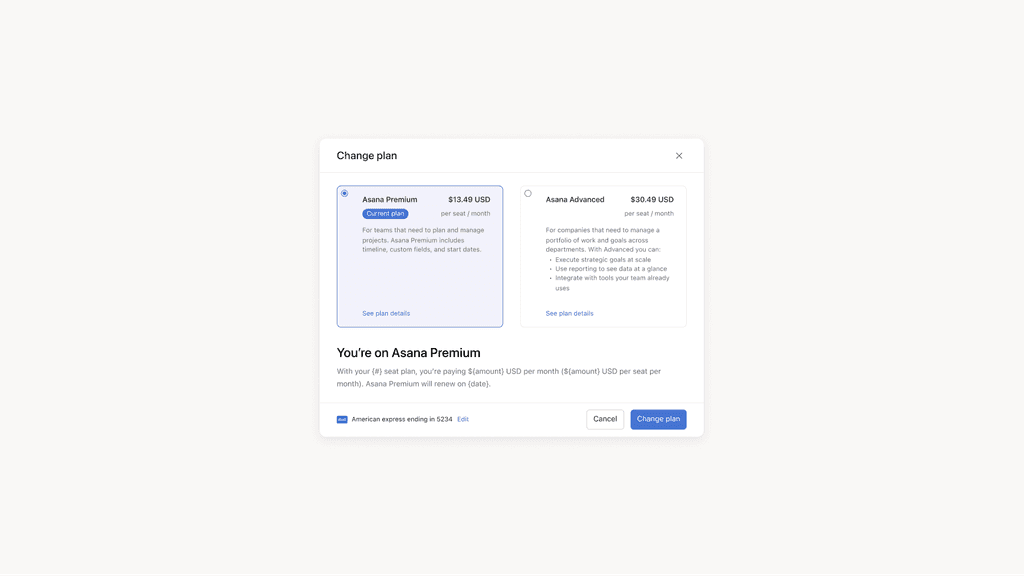
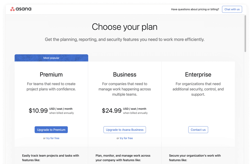
Changing plans
One key surface where users will be able to transition to the new plans would be when they choose to change their plan in product. If they're currently a paid user, they see an experience like below to switch between Premium and Business plans.
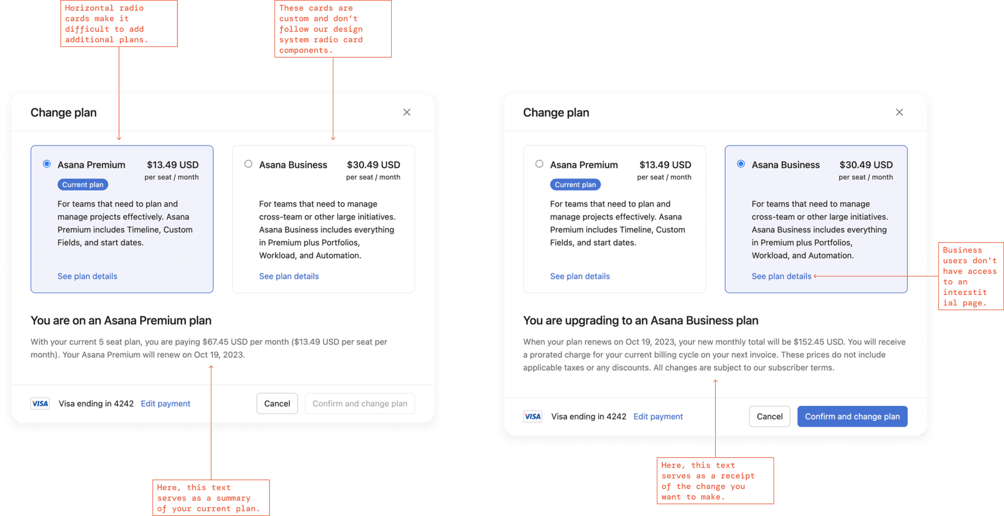
Before I got started, I created components
Creating components for existing surfaces not only helped to update our Pay area sticker sheet but also allowed for easy copy changes.
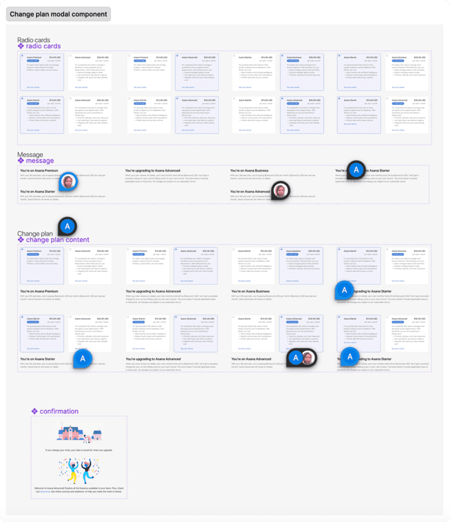
I tried multiple variations
I hoped to reduce the cognitive load of this modal and to update the components to ones that existed in our design system. I wanted a design that could scale easily over time.
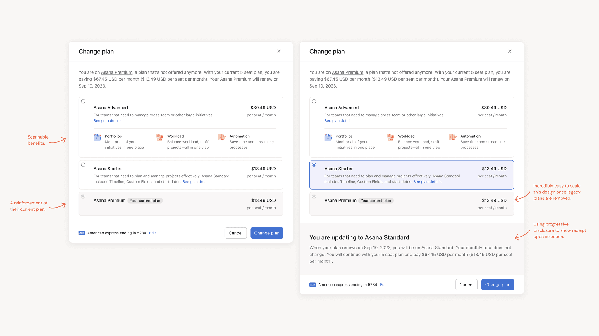
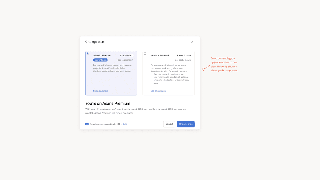
Final solution
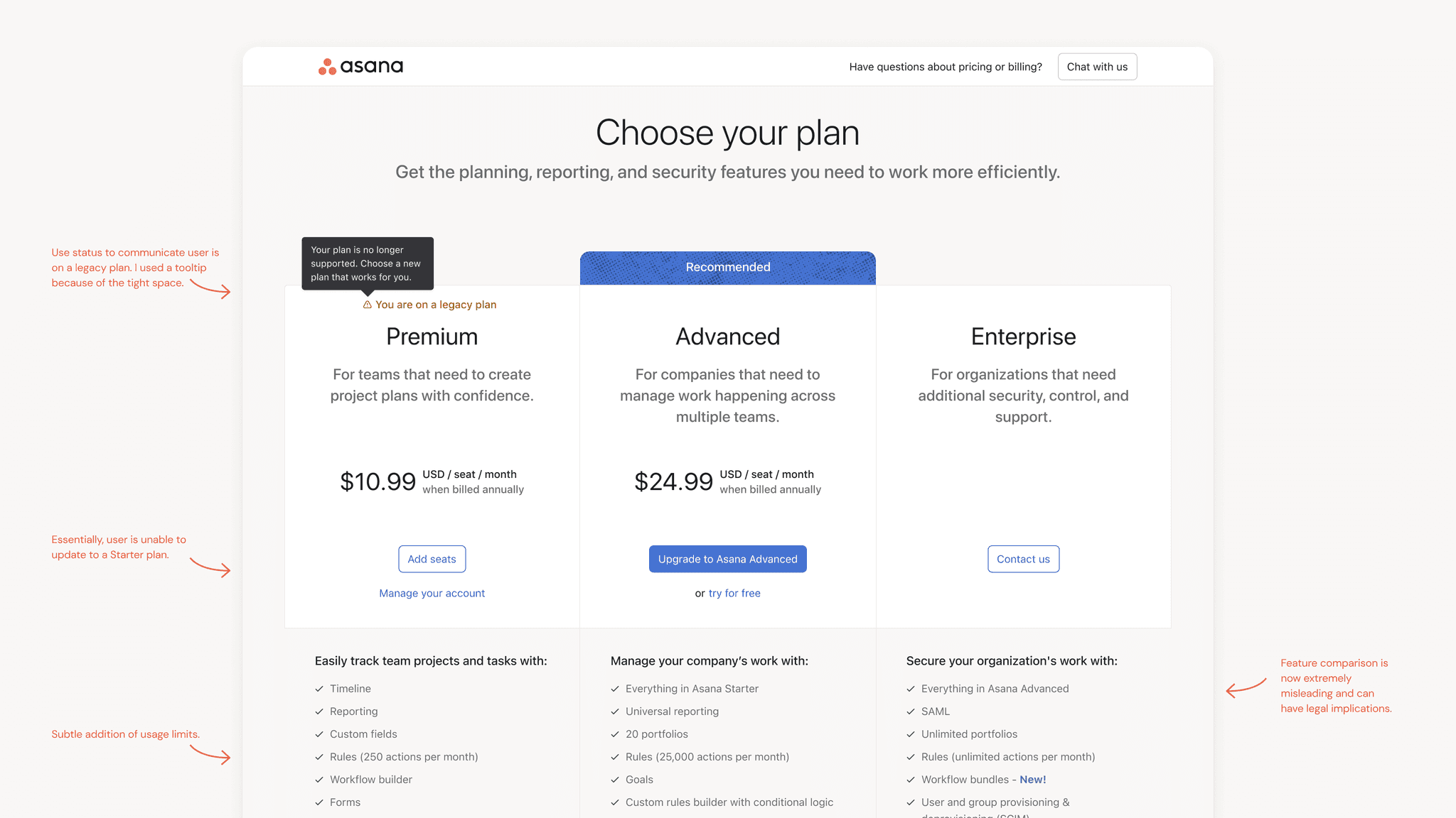
In favor of keeping changes minimal, leadership decided to move forward with the solution below. Though my team didn't agree with the final solution, we decided to move forward to progress the project and revisit once the MVP was shipped.
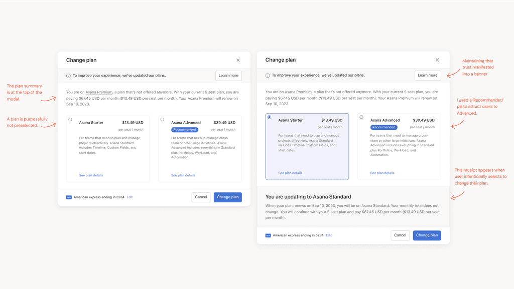
My next steps
Experiments that might be worth trying:
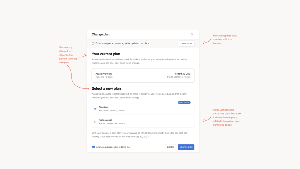
A receipt visual to allow scannable summary of new plan
The vertical radio card design
Personalized recommendation based on usage
A clear path to Enterprise (trigger a sales conversation)
The MVP will give us a new baseline for data. With these experiments, I’d like to pay attention to # of expansion events as well as # of downgrades. It might be interesting to see if users come here after viewing usage limits so that we can use this surface to potentially save downgrading users. I’m curious about the # of sales conversations we can start from this modal and potentially discounts if we find users visiting this modal a lot.
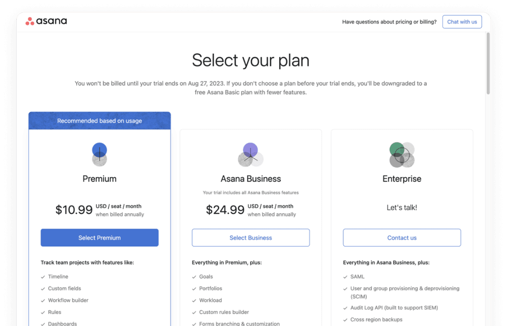
Interstitial
The interstitial page is an in product pricing page experience. We have two variations depending on user type.
Entry & exit paths
This exercise helped me realize there are multiple variations of the interstitial then I had originally anticipated and it helped to guide my decisions and prioritize the necessary items that worked for all variations.
Components
Creating components for existing surfaces not only helped to update our Pay area sticker sheet but also allowed for easy copy changes.
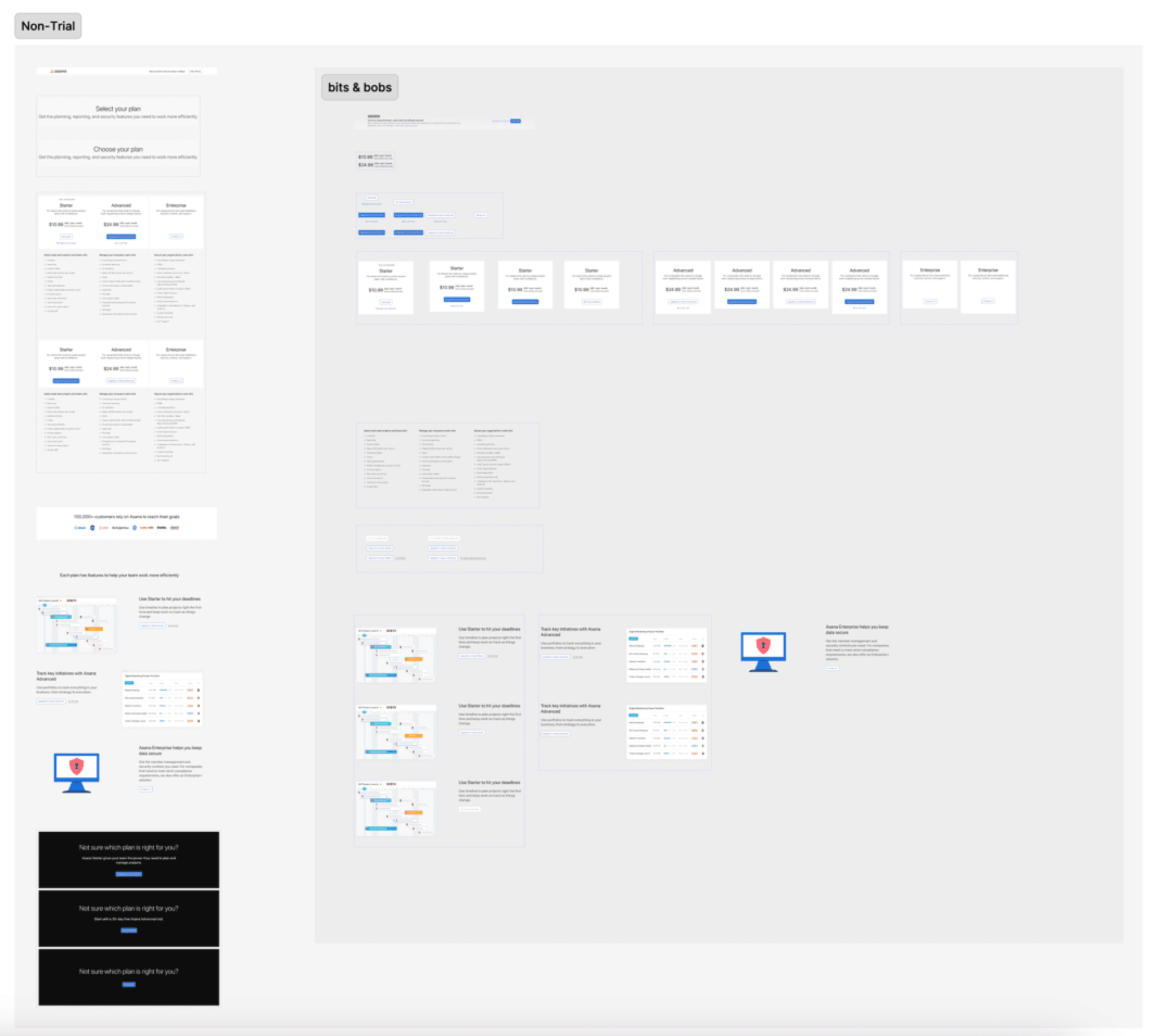
Explorations
I tried multiple explorations to communicate their legacy plans to users and encourage them transition to new plans.

Eyequant
Once the team decided on the final approach, I tried a few variations around placement and color.
I used a tool called Eyequant and ran the designs to see if the distribution of attention in the designs were similar to today’s interstitial page.
Final design
In the end, based on the Eyequant results, we decided on the following design.
Eng deliverable
Learnings
This was a very top-down project but even then it wasn't straight forward. I enjoyed the processes the working group set in place to make quick progress on decisions.
A big trade off was business value vs customer transparency.
Org-wide, we decided not to run any experimentations on this work. It's hard to roll our plan and pricing changes and revert them if an experimentation failed. Thus, we had to be quite intentional about the changes we were proposing.
We had a new content design lead who worked very differently from our previous one.
Nice! Thanks for taking a look. Interested in working together? Send me an email.